
Navigation System
Information Architecture
Features and Content
Ways to Enhancing Usability and Accessibility
The hierarchical framework shows how the key sections of the application is prioritized, linked, and labeled.
Site Map


Personal activity stat
Community Reviews
⭐️⭐️⭐️
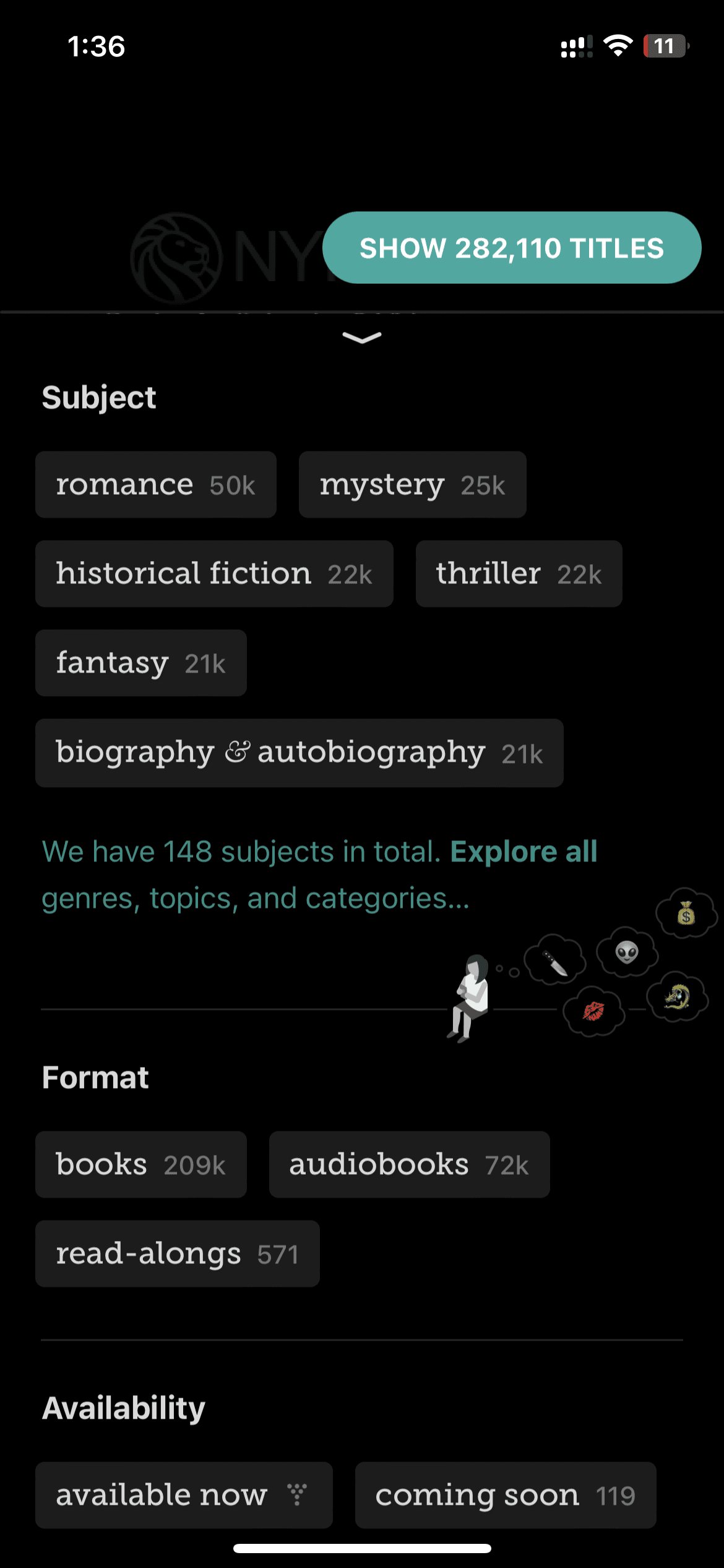
Filtering
Libby implements a navigation menu at the bottom, including four main sections: Library, Shelf, Profile, Search, and Timeline.
The "Library" section is effectively established as the home page, providing an overview of the user’s library system and facilitating access to browsing and account features.
The hierarchical IA even includes useful links to support resources in the side menu, optimizing user self-service.
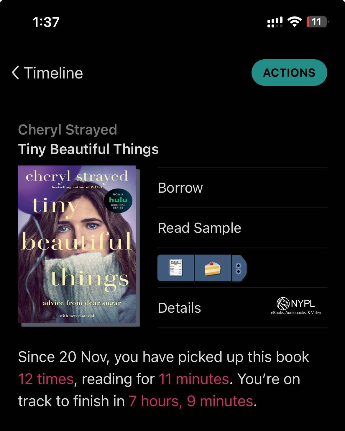
Behind an intuitive navigation system, Libby’s information architecture strategically groups related features and content together in each section. For example, the activity feed and stats in the “Timeline” section gives users visibility into engagement analytics.
The separation of library exploration and personal shelf also creates clear user flows depending on tasks—browsing new titles vs managing current loans. Creating a clear navigational difference.
Libby surfaces frequently-used features prominently, like the updates feed on the library page and the search bar persistently available in the header.
Tile-style content displays with cover images also enable visual scanning.
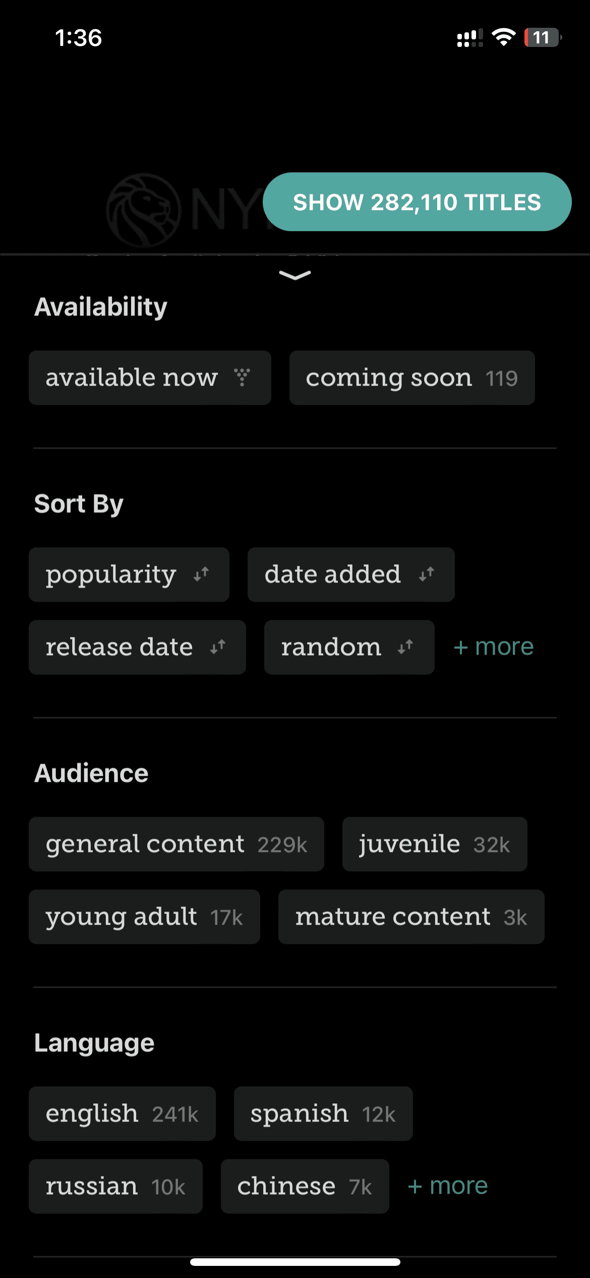
Additionally, Libby offers extensive filtering and recommendations to connect readers with relevant materials.
Features like custom tags and tracking reading progress create a personalized experience steeped in community elements like reviews.
The rich content coupled with intuitive access points makes discovery both targeted and serendipitous. Overall, Libby’s system design empowers users to effectively utilize a full-service digital library.
The account and settings pathways contain access barriers—from the multi-step login process to convoluted library switching protocols.
Streamlining account management through saved preferences and centralized dashboards can improve self-service productivity. Allowing login customization also benefits users with accessibility needs.
Despite robust filters, Libby’s search lacks advanced parameters seen in library catalogs. Enhancing search to include boolean modifiers and additional output customization grants more control over discovery.
Similarly, upgrading filters like subject terms and reading levels contributes to relevant, high-yield results.
While Libby integrates certain accessibility features today, further efforts to support adaptive technologies could expand its reach tremendously. Continued compliance with Web Content Accessibility Guidelines (WCAG) and responsive design would be instrumental in promoting inclusion.


References:
Libby Icon: OverDrive, Inc. (2023). Libby [Mobile application software]. Libby, by OverDrive. https://meet.libbyapp.com/
All other images taken from Unsplash
Illustrations: "Free illustrations from Streamline."
Navigation
Features
Interface