
Designed & Developed by XP DESIGN

Filter & Search
A look at how the search feature works on the Libby application.
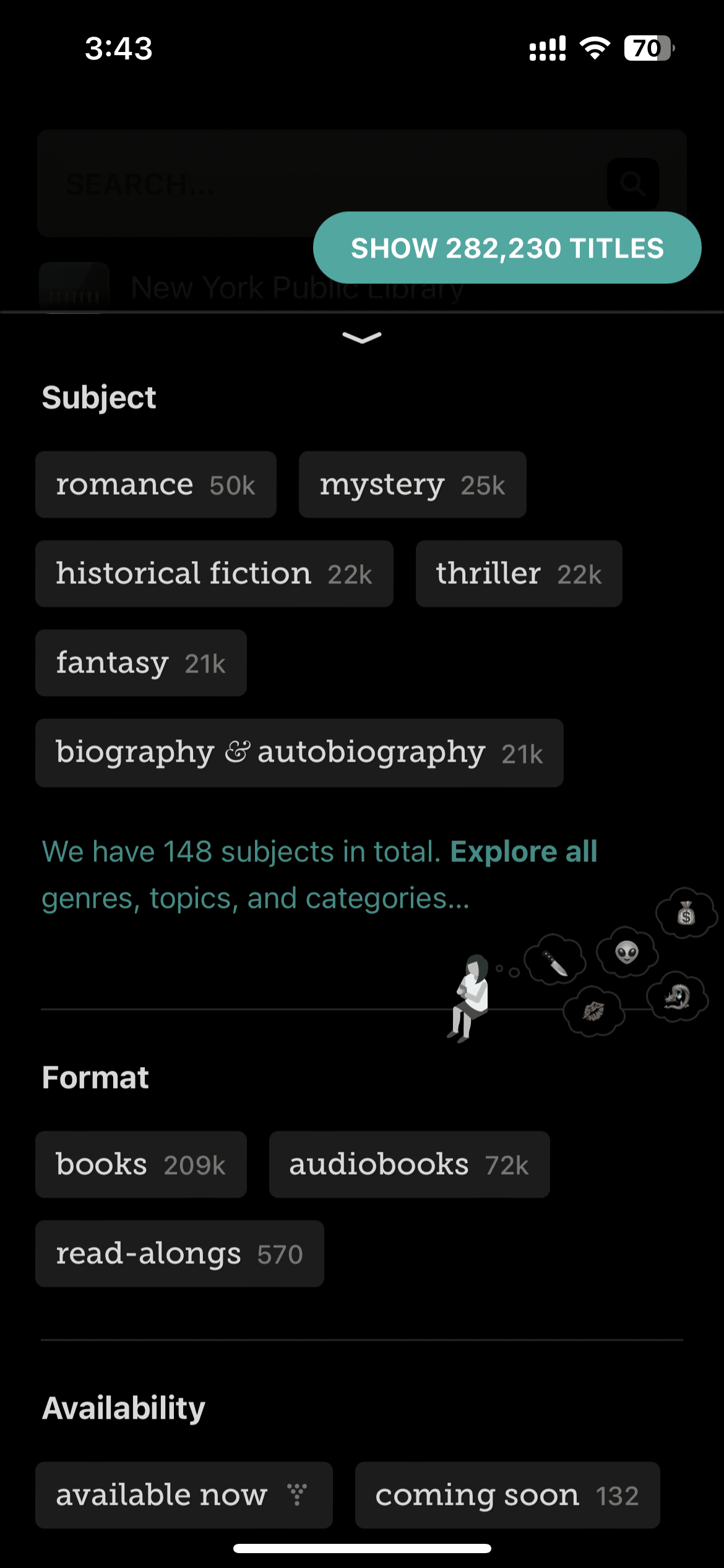
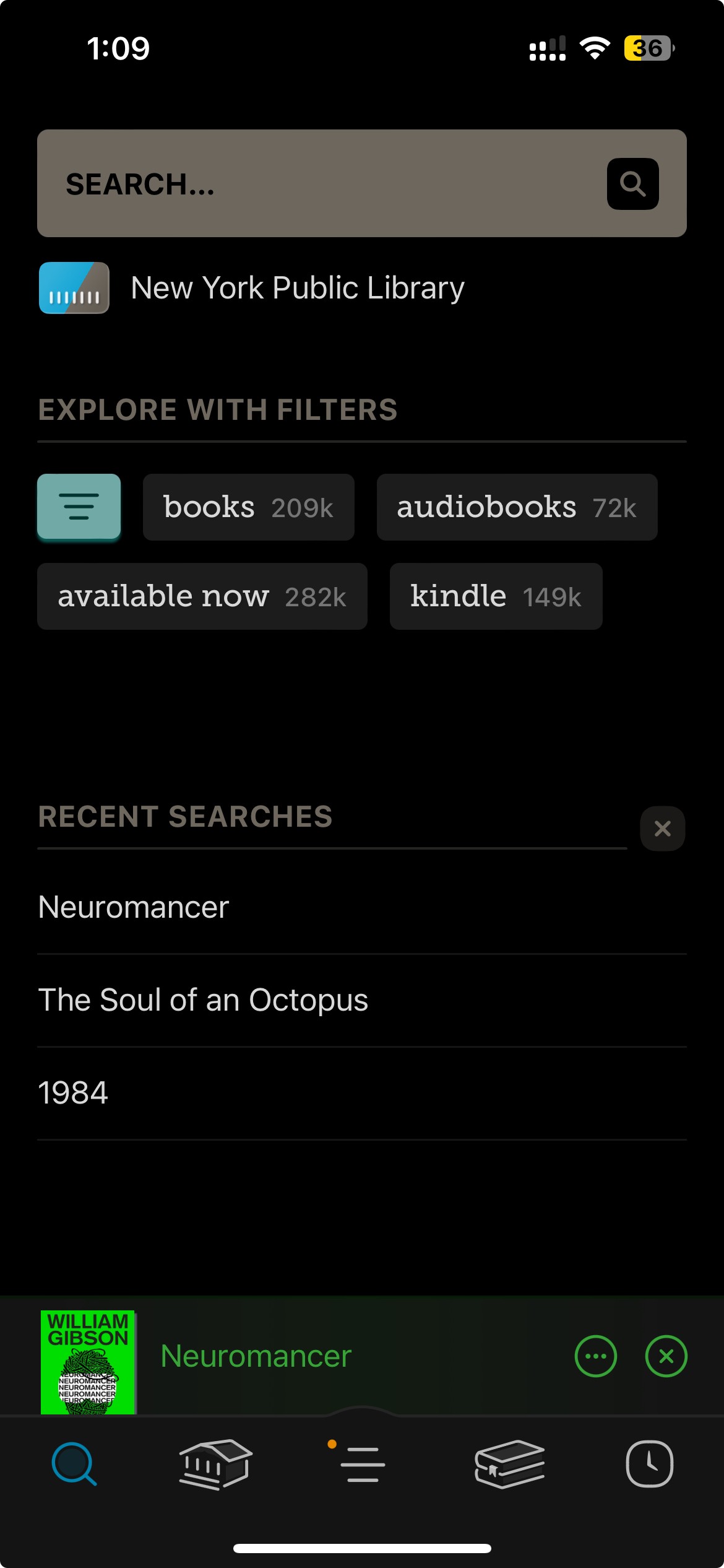

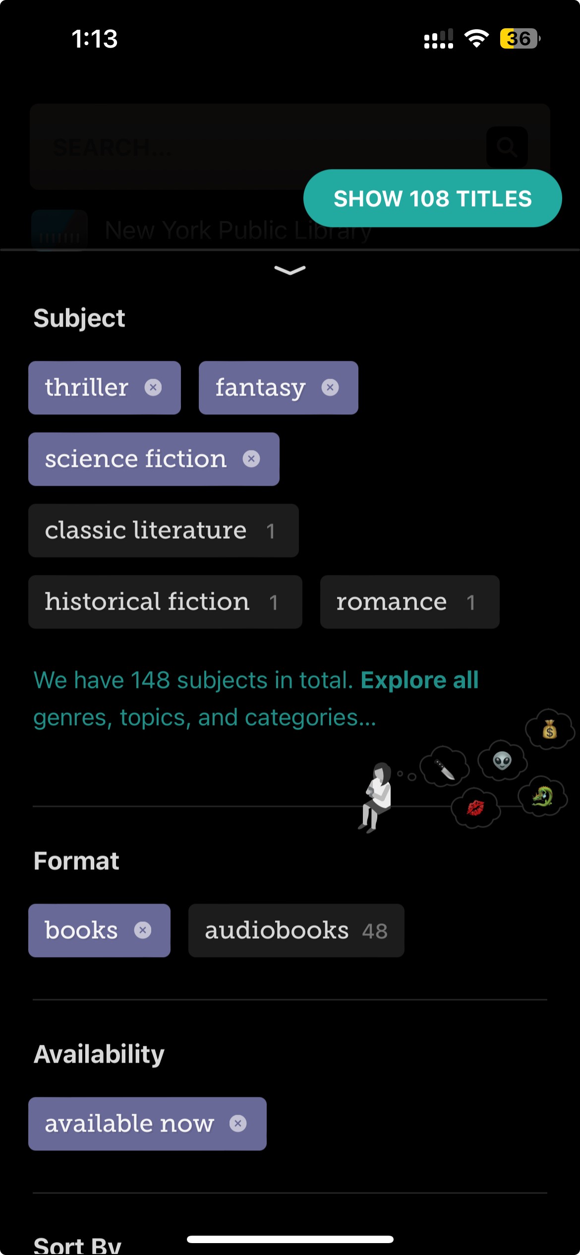
Powerful search for the win
An Assessment of Filtering
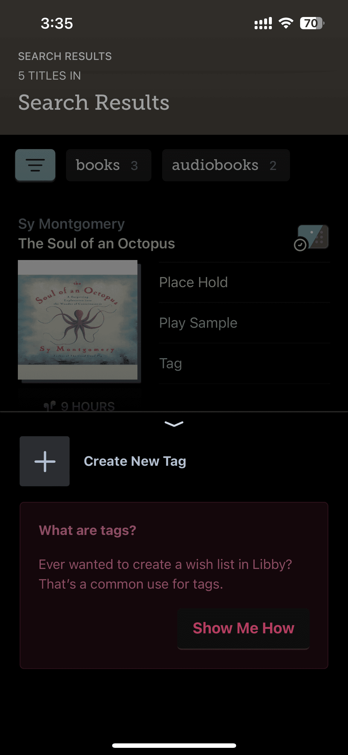
The search feature on Libby is quite powerful and extremely user friendly.
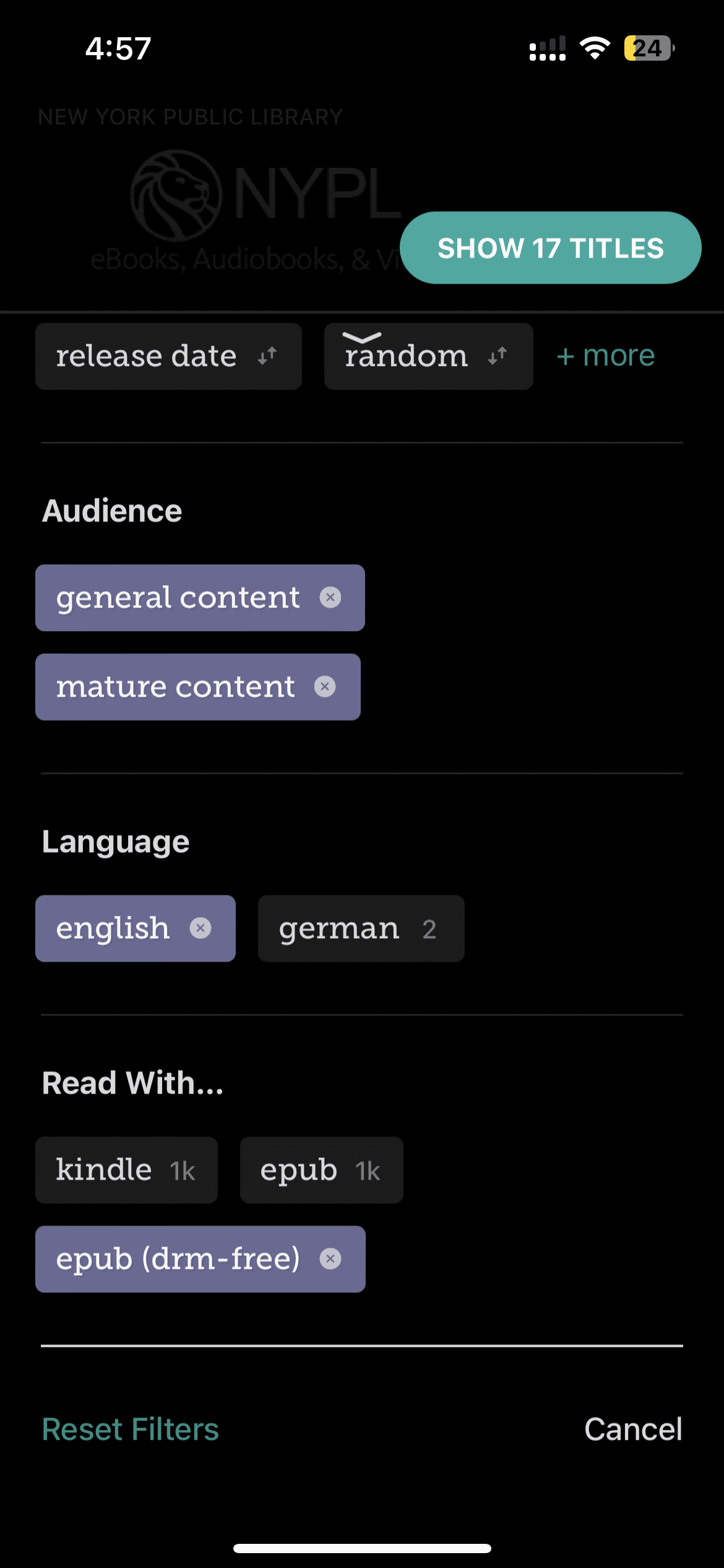
It is quite responsive and gives users a clear idea of their selected categories and the number of books available for that particular selection.
A live status of the number of books available in that particular library really makes users feel the amount of knowledge available at their fingertips through this app.
This is I believe a big strength for the app and is something I am sure they have iterated on a lot over their years of experience running the older Overdrive app.
This is where your libraries are listed.
One Point of critique here is that you can do global search.
Meaning, search for books/ audiobooks from all your registered libraries at once.
It is an obvious search filter, and I’m sure users will appreciate
a feature like this.
Having a Show/ Search button at the bottom of a filter section is
standard practice.
I would like them to follow these simple decisions a bit more rigorously.
Things like this overshadows the efficacy of their powerful search tool.
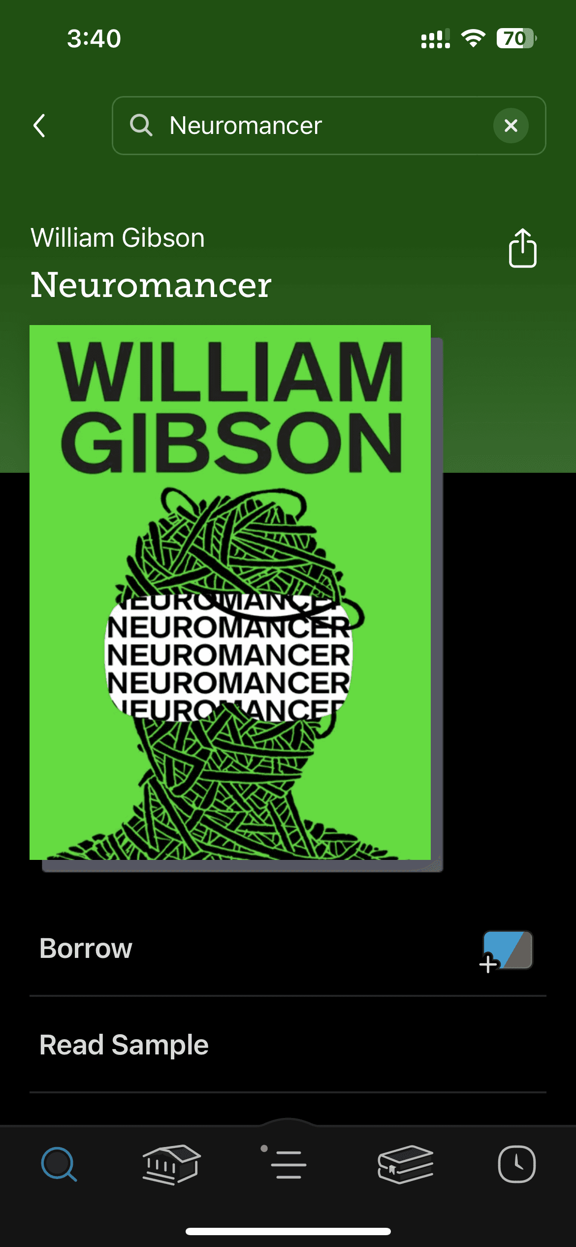

‘Reset Filters’ can go on top.
References:
Libby Icon: OverDrive, Inc. (2023). Libby [Mobile application software]. Libby, by OverDrive. https://meet.libbyapp.com/
All other images taken from Unsplash
Illustrations: "Free illustrations from Streamline."
Navigation
Features
Interface